
_edited.png)
Bold Can Also Be Pretty: Building a Quilt Bundle with Contrast
- aribbonrunthruit
- Apr 26
- 2 min read
Sometimes when people think of “pretty” quilt fabrics, they picture soft florals, pastels, and delicate prints.
And I love those too.
But sometimes… pretty needs a little contrast.
Sometimes the fabric pull needs something bold to keep it from feeling too sweet or too flat.
That’s exactly where this week’s bundle started.

A soft pink floral.
A bright yellow solid.
A rich pink blender.
And a strong black solid.
At first glance, the black might feel unexpected—but honestly, it’s what makes the whole combination work.
Why contrast matters
When you’re choosing fabrics, contrast is what helps your quilt design show up.
Without it, everything can start to blend together.
The floral brings softness.
The pink adds warmth.
The yellow adds light and brightness.
But the black?
The black creates definition.
It gives your eye somewhere to land and helps the lighter fabrics stand out even more.
Starting with simple units
I didn’t start with a big, complicated plan.
I started with simple pieces—small units that let me test how the colors worked together.
Sometimes that’s the best way to build confidence with a fabric pull.
Just sew a little and see what happens.

That’s usually where I decide if a bundle is working… or if it needs one more fabric.
When the block starts to make sense
As the pieces came together, the contrast really started to show.

This is the moment I love most—when separate fabrics stop looking like individual choices and start feeling like a finished quilt.
That’s where the design starts to feel real.
The finished block
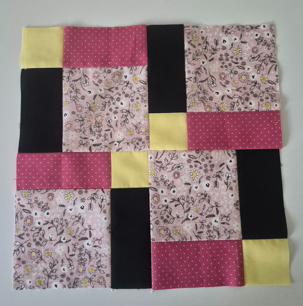
And this is where it landed.
Simple construction.
Strong contrast.
Soft prints balanced by bold solids.
And proof that “pretty” doesn’t always have to mean soft and subtle.
Sometimes bold is exactly what makes it beautiful.
A good reminder
If your fabric pull feels like it’s missing something, it might not need another floral.
It might need contrast.
A darker solid.
A stronger blender.
Something that helps everything else shine.
That’s often the difference between “nice” and “wow.”
If this combination caught your eye
This is the same fabric mix I’ve been working with this week—soft florals, bright color, and just enough contrast to keep it interesting.
I love seeing how a simple bundle can shift once you start cutting and sewing with it.
If you’d like to take a closer look at these fabrics, you can find them here →
Sometimes seeing the pieces together makes all the difference.
Final thoughts
Don’t be afraid of bold.
A strong contrast fabric doesn’t take away from the beauty—it helps create it.
Sometimes the prettiest quilts are the ones with a little bit of edge.


Comments